Temporal evolution analysis
With Analytics view!
version 3.0.5.7
With this tutorial you will be able to:
- discover temporal evolution of publications of each corpus year by year or month by mont or hour by hour; in fact you can choose the granularity according to your dataset!
- compare the evolution of your corpus with others corpora
- compare the evolution of some specific multi-terms in your corpus
- customize your histogram
How to get the Analytics page ?
In each corpus, read the menu and click on the « Analytics » page.

Click on the page Analytics in the menu.
What is the first view of analytics ?
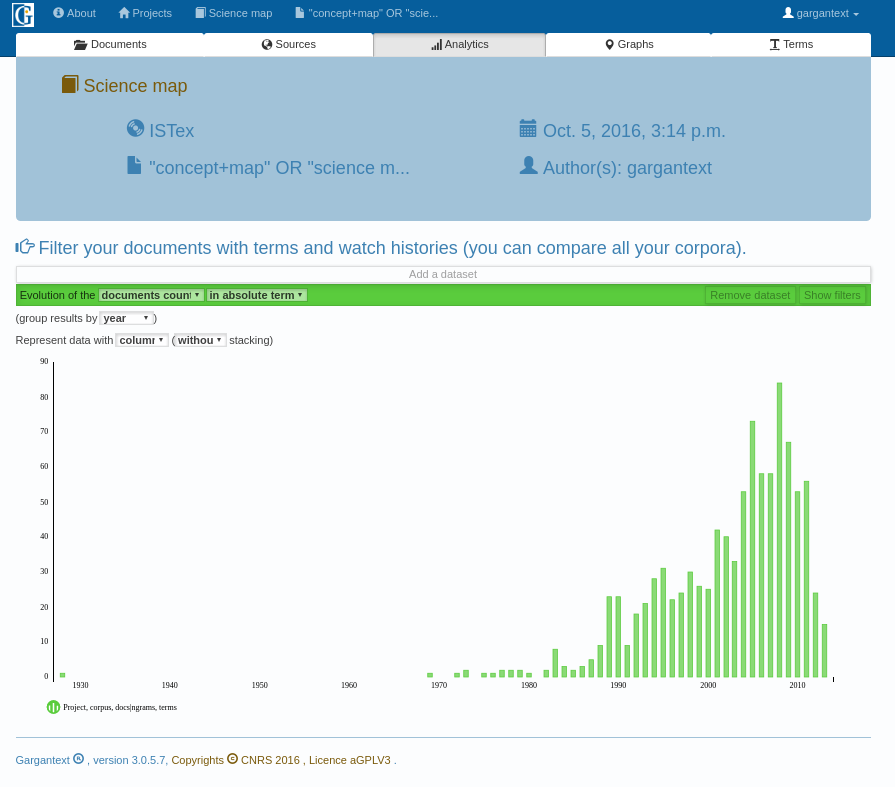
At the first sight you can discover the temporal evolution of all documents of your corpus.
You can change the granularity of the x axis by decade, year, month, day or hour.

Select the granularity for the x axis by decade, year, month, hour…
For example, the image below shows date of publications grouped by decade whereas the previous screenshot has shown publications by year.

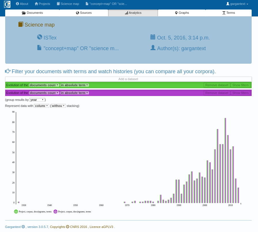
Click on this dataset bar to add another dataset to your histogram
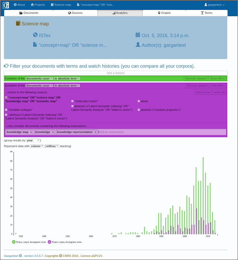
Click on « show filter » to filter the dataset with many options
Each numbered hotspot of the image below can do the following:
- You can select another corpus different from the current one and compare the evolution of each
- Current Dataset (purple color) can represent one or more corpora (all data will be grouped for all selected corpora)
- Filter with multi-terms. You can add as many multi-terms as you want. Tape just 3 letters and completion will indicate which terms are in your dataset
- In that histogram, the curve of the global documents is different from the curve of document related with « knowledge » mapping. Some new concepts should be investigated during the last period of the dataset. Keep on working on your dataset 🙂

This this the corpus currently shown with the purple bar
Check the boxes in order to group corpus in the purple bar.
Filter with the terms. 3 letters enable the automatic completion. You can add as many terms as needed (for synonyms for instance).
Discover the result on the histogram.
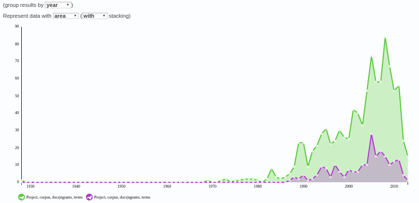
You can customize your histogram with area (or curves) for intance on the image below.

Histogram can be represented with lines or areas or bars.
How to use this histogram in my report?
Take a screenshot of the histogram in order to insert it in your report if needed. The legend can be improved, you can contribute and help us to improve the analytics page. Every collaboration is welcome (see http://code.gargantext.org)!


